Decluttering the Camera Roll
Redesigning Apple's iOS 18 Photos app to fix a cluttered layout, unreliable search, and missing onboarding.
PROJECT
Academic
Team of 4
ROLE
Lead Designer
UX Researcher
Project Manager
DURATION
Winter 2025

Overview
Impact
We tested our prototype with 3 participants. Every task we measured came back easier than the iOS 18 experience, and testers described the result as something Apple could have shipped.
9-10/10
album finding experience across all 3 testers
8–10/10
library navigation experience across all 3 testers
7–8/10
overall navigation experience across all 3 testers


How We Got There
CONSTRAINTS
What We Were Up Against
This project was shaped by what we could change about the product, and who were making the changes.
Apple Intelligence Was Off-Limits
Apple Intelligence features like Clean Up and Genmoji had to stay fully intact, so even when users found the app cluttered, we could only reorganize what existed, never remove a feature outright.
Make it Feel Like Apple
Our redesign had to match Apple's existing visual language — typography, color, interaction conventions. The bar wasn't just fixing the problem; it was fixing it in the way Apple would.
Leading Designers Who Weren't
My teammates weren't design majors and lacked design fundamentals. I owned design decisions, managed the project's direction, and guided my teammates through the design process.
BUSINESS CONTEXT
Why the Redesign in the First Place
Apple had clear goals for this redesign. Our research showed they didn't hold up.

Automation at the Forefront
Apple's WWDC24 announcement said the goal was to help users "easily find and relive special moments" through automatic, themed collections instead of albums. Craig Federighi, Apple's SVP of Software Engineering, connected the redesign to Apple Intelligence, describing both as part of the same push for "personal intelligence."
Reducing the Friction
Billy Sorrentino, Apple's SD of HID, stated: "As our features, users and libraries have grown, so has the density of the Photos app. Rather than hunt and peck throughout, we've created a simple streamlined single view... based on deep intelligence. Ultimately, we wanted to remove friction."
Friction Came Right Back
The single view did the opposite of what Apple promised, burying the content users wanted behind algorithmic suggestions — a frustration echoed in thousands of upvotes on r/ios.
Apple seemed to agree. iOS 18.2 restored swipe-to-go-back in Collections — the same navigation friction our research surfaced — and later updates added back library filtering. While Apple never undid the redesign, they incrementally added back friction-reducers they removed.
RESEARCH
Coming Up Again & Again
We ran a heuristic evaluation, 8 interviews, and 8 usability tests (2 each), spanning high schoolers to adults in their 50s. Interviews revealed user needs; tests showed system issues. Heuristic evaluation backed all four insights; most valuable for what went unspoken.
STRUCTURE
Reintroducing the App's Navigation
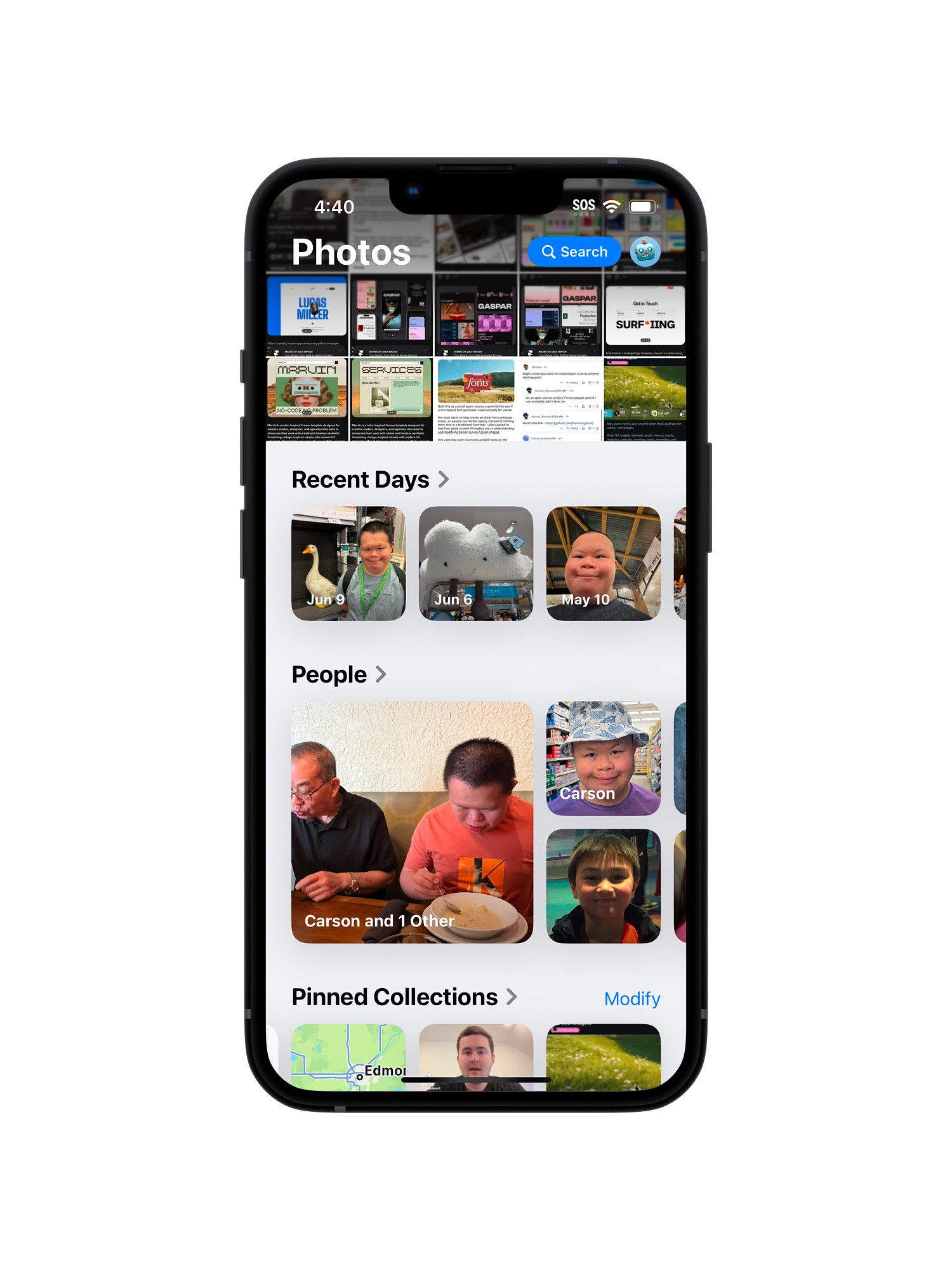
This wasn't a new pattern, it's iOS 17's tabbed structure, replaced by iOS 18's single scroll. Users described the app as separate tasks, not one feed, so we restored it and focused effort on the content within.


4 Separate Tabs
We split the single scroll into four spaces: Library, For You, Albums, and Search. For You and Albums use the same components and categories iOS 18 already introduced, Memories, Featured, Media Types, Shared Albums, just split into two separate tabs instead of one mixed feed. This removes the confusion of unrelated content appearing next to their own.
ITERATIONS
Ideas That Didn't Hold Up
We moved from sketches to a tested prototype, revising decisions for Pinned collections and Search.

Casting a Wide Net
I explored layout and interaction directions for each of the four tabs, evaluating their options against research findings before narrowing down.

Sketch
Hi-Fi

Sketch
Hi-Fi
Bringing Structure to Search
Participants couldn't find or understand filters, and results came back as one uncategorized list. We first tried a segmented date view like Library's, but it still needed a separate media-type menu and looked too close to that screen. Next we split results into collections and all-photos views, but content stayed mixed and still too much to view at once. We landed on tabbed filters mirroring Music and TV, defaulting to a gallery view organized into sections that open into their own page.
USABILITY TESTING
Putting the Redesign to the Test
We ran three user tests on the prototype, each covering four tasks: customizing For You, searching, finding an album, and pinning a collection. Onboarding wasn't part of this round.

Browsing For You
All testers responded well to the layout, calling it "organized" and "clean, it makes sense." Customizing was equally smooth, with the Edit button "right in front."

Finding an Album
This was the strongest result of any scenario: 2 testers rated their browsing experience 10/10 scores and one 9/10; testers called it "super easy to get to" and "grouped in a way that made sense."

Searching a Photo
Search rated well overall, and navigating to it was simple since "the screens are all at the bottom." One issue came up: preview image size, though pinch-to-zoom was part of the intended design but it's a gesture Figma couldn't simulate.

Pinning a Collection
All three testers struggled to locate and use Pinned Collections. Since Figma can't simulate tap-and-hold, we approximated it with a tap-to-open menu wired to one predefined item — a limitation our instructions never flagged. The prototype also lacked a view/edit page and an overflow-menu option.
Our four scenarios succeeded without a walkthrough, since they leaned on familiar patterns. Pinning was the one truly new interaction, showcasing where onboarding would help most.
FINAL DESIGN
Apple's Language, Reorganized
The current design, followed by what we changed and why.
Current Design
The current layout of Photos.


New Design
Five areas that saw the most significant change from Photos.
REFLECTION
Lessons Moving Forward
The redesign was only one battle. Leading the team through it, and working around the tools we had, taught me just as much.
Back to the Original Goal
Apple wanted to remove friction with a single, intelligence-driven view instead of albums, but our research showed that friction came right back, buried behind algorithmic suggestions. Our redesign meets that same goal: separating recommended from user-created content, restoring navigation, and adding accessible customization.
Leading Without Buy-In
My teammates weren't equally invested, so I ended up leading design and project management. I set expectations, checked in regularly, even asked instructors for advice, but couldn't make people care who didn't want to. In the end, it came down to pushing through and getting the work done without everyone on board.
Prototyping With an Asterisk
Figma couldn't simulate tap-and-hold or pinch-to-zoom, so we tested approximations instead. A tool like ProtoPie or Bolt.new would have let us validate them directly, but the curriculum and project timeline ruled that out.
NEXT STEPS
Where We'd Take It Next
Two things this project didn't have scope to fully address: validating further, and design beyond the phone.
Testing at Scale
A higher-fidelity prototype, tested with a wider group of users, would further confirm whether these solutions hold up beyond three testers. It would also uncover any issues that remain against the actual iOS 18 Photos experience.
Photos Across the Ecosystem
Photos lives across Apple's devices, each with different screen sizes and interaction conventions. Extending this redesign means rethinking how navigation and pinned collections translate to iPad's larger canvas or Mac's windowed interface.
See Something You Like?
Available for full-time roles, freelance projects, and brand collabs.


