Building Creator Connections
Creating a curated space for content creators to connect with their peers, be part of a community, and grow their careers.

Overview
Creator Connect soft launched in April 2026 with no ads, no social content, and minimal outreach — a test of whether creators would seek the site out on their own and stay once they did.
319
creators found the site
10m23s
average session
17
creators joined our Discord
These are early signs, not proof. Creator visits and session length could be skewed by outliers. Still, the data shows creators are sticking around, not just clicking through. Full launch is pending.






How We Got There
RESEARCH
Coming Up Again and Again
Through a digital ethnography, user interviews, and a survey, I surfaced four key insights that shaped the product.

THE LANDSCAPE
Close, But Not It
Was this gap already filled? I audited 8 social platforms on their design, tone, and structure to see where creator connection actually shows up.
Community Platforms
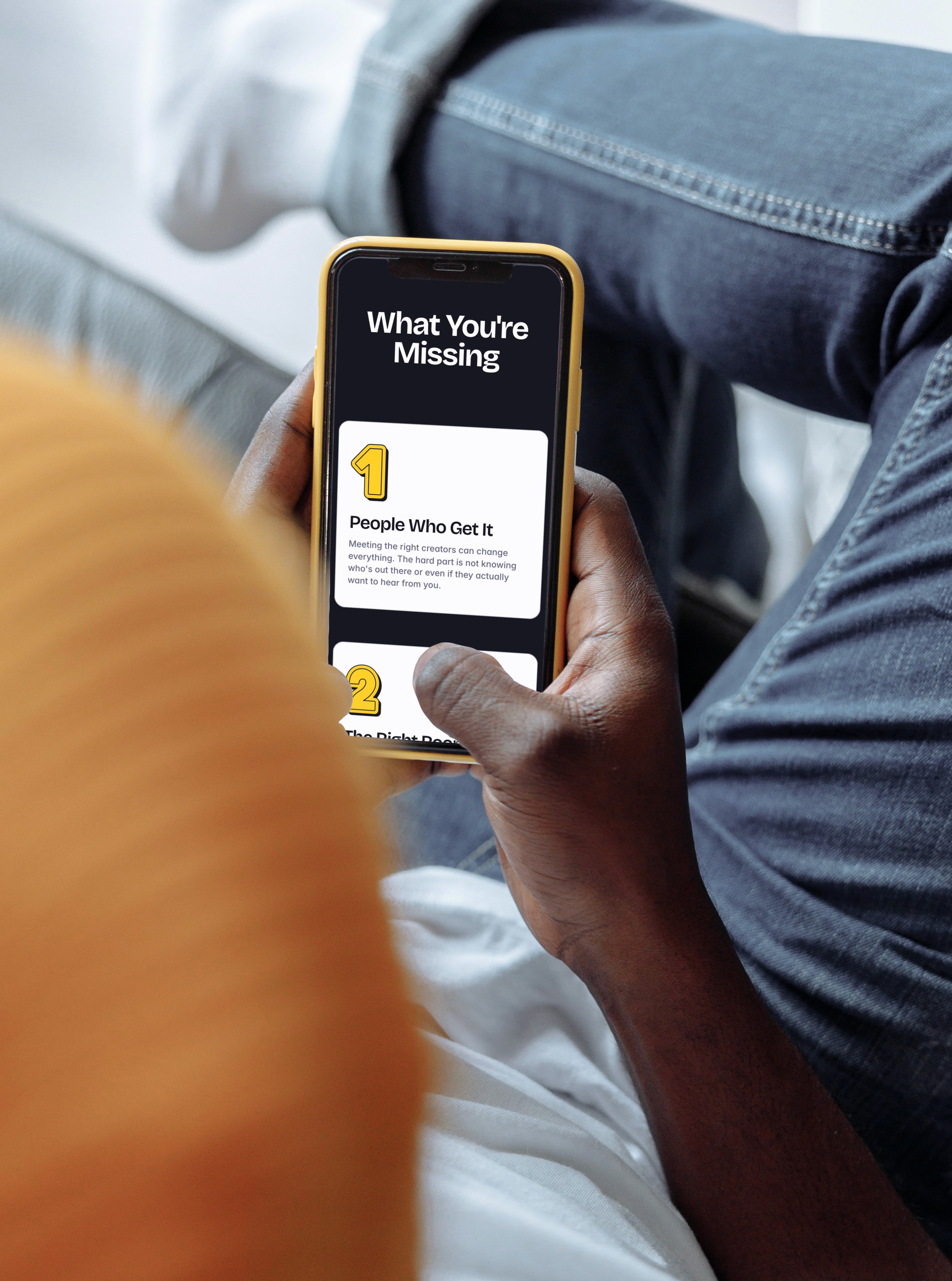
Platforms like Discord and Reddit organize around servers and threads, not people. There's no way to discover or vet a specific creator worth connecting with, and valuable exchanges disappear once a conversation moves on, the same problem Insight 2 found directly.
Professional Networking
LinkedIn comes closest, with searchable profiles built for outreach — but for professional networking broadly, not the creator-specific fit Insight 3 found creators actually needed.
The Takeaway
Across all 8, connection was never the core function, only a side effect of audience growth, algorithmic engagement, or career advancement. No platform was built for what creators actually needed. That's the gap the Pivot decision was built on.
THE PIVOT
Connection at the Core
The original concept was a dedicated social platform for creator discovery, connection, and collaboration — the obvious answer when nothing else filled the gap. But that's exactly where the research pushed back.
The Key Insight
Creators didn't need another platform to perform on. They needed quality, clarity, and reason to stay. An attention-driven model would work against all three. So the real question wasn't how to build a better platform — it was whether to build one at all.
The New Direction
Curation over algorithmic distribution became the guiding principle. The idea shifted to a smaller, intentional space where creators feel seen, not overshadowed; supported, not isolated; and connected as collaborators, not competitors.
The Right Call
Building from scratch would have been costly, hard to monetize, and just another platform fighting for attention. Meeting creators where they already are meant building on existing behaviours, not asking them to adopt new ones.
TECHNICAL DECISION
Weighing the Options
Before designing anything, choosing the right kind of platform came first. Four categories, none of them were perfect.

Tradeoff
Framer can't support a backend if the project grows beyond front-end. Designs were built in Figma first for faster system building and iteration, then transferred to Framer by hand, costing time but keeping design quality and control intact. Even so, these pros mattered more than infrastructure for a concept that hadn't proven itself yet.
BRAND & CONTENT STRATEGY
Bringing the Human Touch
The brand had to feel like a space where creators belong: personal and inviting, but still contemporary and digital.
Creating Warmth Across the Design
Creators needed to feel seen, not overlooked. Warm colours, approachable typography, and playful illustration weren't just aesthetic choices; they signalled a space built for people, not performance.

From "Networking" to "Connection"
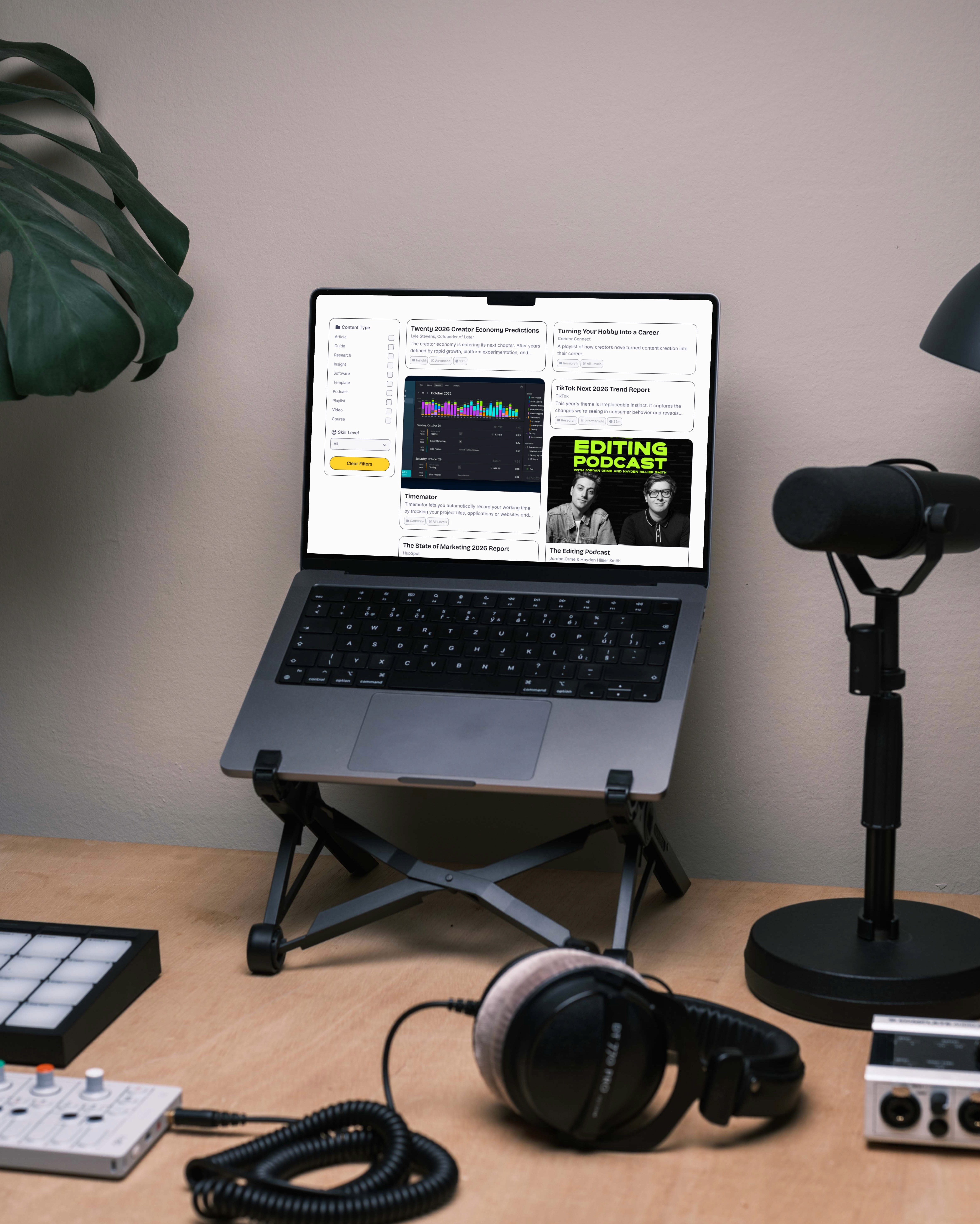
Language and structure are a core part of the user experience. From homepage messaging to component-level copy, every line had to be authentic to its community.

Corporate
Formal
Warm
Missing The Mark
Creator Connect was originally framed a professional networking space, but a conversation with a creator changed everything: they had group sessions where creators would commiserate over the struggles and successes of building a creative business.
A Warm Change
What I thought was just plain networking was actually connection: people coming together to learn, share, and grow. Functional language shifted to copy that felt genuine, rhythmic, and emotional — writing as if we were part of their journey.


Foundations
Colours (50–1000), typography (size and weight), and spacing (a 4pt base scale) are defined as primitive tokens, giving the system the right level of flexibility and abstraction for a product at this scale. Generally, colours are used decoratively except for Connector roles — a system that identifies trusted creators.
Illustrations
40+ custom illustrations are used across Creator Connect's online presence. Each are built on simple shapes, black strokes, and a shadow or outline. They can also be recoloured within the token system without losing their character.
Components
Cards and their inner components are built with variables — data passes through each component so the card can be updated on the canvas or through the CMS without rebuilding. If a field has no data, the element doesn't show.
Responsiveness
Performance, consistency, and quality had to hold up everywhere. I tested across browsers and breakpoints on real devices — old and new, large and small. That meant adapting typography and spacing, and rebuilding layouts and components for each breakpoint.
FEATURES
Answers to the Research
Four feature responds to a specific research insight, giving creators the structure, signals, and reasons to connect.
DESIGN DECISIONS
Deciding Who and How to Connect
Two decisions shaped whether Connectors could actually earn a creator's trust: how to show them, and how to let people reach out.
Showing the Right Signals
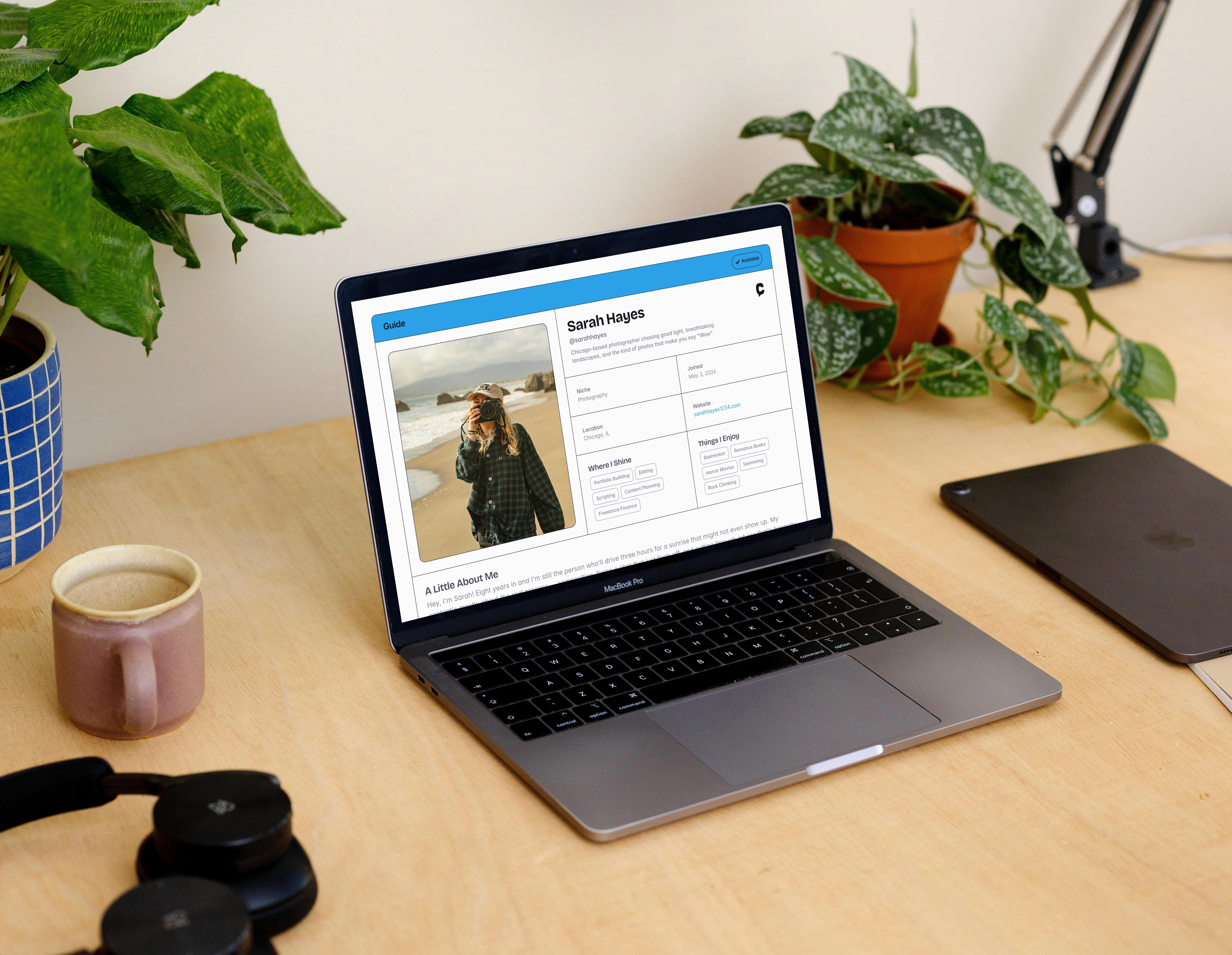
A name and a niche aren't enough to judge if someone's worth contacting. Each version was checked against one question: could a creator tell who was open, available, and aligned? It took three tries to get there.

V1
V2
V3
V1: Modal & Sheet
Good for quick browsing, but lacked the depth a creator profile needs. Content was hard to resize, and key signals got buried in blocks of text. Framer also couldn't support direct links or CMS integration in this format, limiting both reach and scalability.
V2: Dedicated Page
More room helped, but scannability remained an issue, since some signals still depended on what the Connector chose to write. The two-column layout introduced a new problem: images scaled awkwardly on resize, pulling focus away from the main content.
V3: Final Page
Scannable content was added as pills and small headers, like expertise and interests. Portfolio and images were cut, reducing clutter and extra weight. Visuals and language were refined, resulting in a cleaner hierarchy and a profile that gives creators confidence before reaching out.
A Form, Not a DM
Reaching out through social links was the obvious choice, but it wasn't the right one.


Socials
Social links would send creators straight to someone's DMs. Fast and familiar, using methods people already know. But it recreated the original problem: no structure, no guaranteed reply, and creators competing for attention again.
Forms
Outreach goes through a form built into the profile instead. It works as a short introduction (who you are, what you do, why you're reaching out) built to earn a reply, not carry the whole relationship. The depth comes from the conversation it starts.
Tradeoff
A form asks more than a tappable link, so the added friction costs some convenience and some messages, but trades them for intent, and structure.
MARKETING
The Launch So Far
The full marketing strategy was ready, but time constraints meant the soft launch ran on minimal outreach. What happened next was unexpected.
The Outreach
The soft launch ran on minimal outreach — DMs and emails asking creators to join as Connectors. Most went unread, and the few who responded were too busy, including creators who had previously expressed interest. This was a direct echo to the research: life gets in the way of connection.
The Surprise
Without a single public post, 319 creators found Creator Connect organically with 2K page views. How they are finding us isn't clear, but they're staying for an average of 10m23s and joining our Discord community.
What's Next
Before making any major decisions, data is the priority: understanding how creators are finding us, what's resonating, and how community is forming. Outreach volume, form submissions, and content analytics are just some of the signs I will be watching.
REFLECTION
What I’d Tell Myself
Building solo taught me more than any brief or timeline could have planned for. These are just a glimpse of the many lessons I learned.
Start with the Basics
Too much time was spent fixing things that should've been locked in earlier; without setting clear goals and proper direction, "final designs" got rebuilt more than once.
The Rest Will Come
The product I shipped wasn't the one I envisioned — features that should've been dynamic stayed static, and a lot had to be let go. What people see today is version one; it's not the end all be all.
See Something You Like?
Available for full-time roles, freelance projects, and brand collabs.


