The Honest Side of Design
Building a platform where designers can share their design journey through anonymous public entries.

Overview
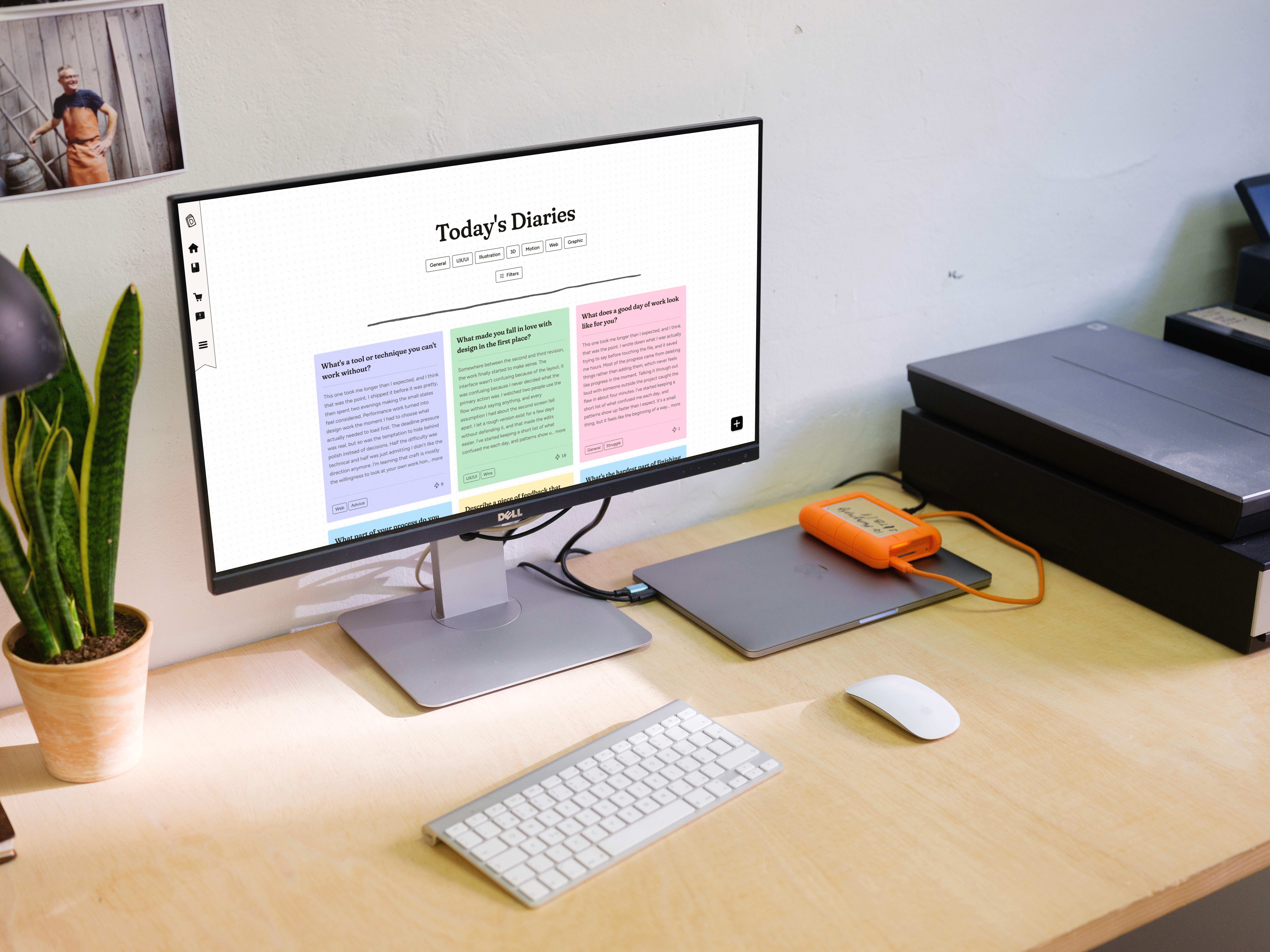
Design Diaries is live. Before launch, early reception from testing was strong:
"I like the privacy aspect. So no one knows who anyone is, but they're all here sharing their experience."
"I like it being kind of a community, a communal information hub for design students."
"I think this one is really new. The app is new and I haven't seen anything like this before."


How We Got There
ASSUMPTIONS
My Theory Going in
Before any research, Design Diaries was built on a few core beliefs about what would make this kind of space work.
Peer-proximity Beats Seniority
The most useful advice comes from someone close to the problem, not an expert.
Anonymity Reduces Fear of Judgment
Stripping away names and experience would encourage designers to share more openly.
Post Interactions can Signal Trust
A simple community signal, like a boost, can stand in for "this is insightful."
Impermanence Feels Freeing
Content disappearing after a set number of days keeps the space feeling present and low-stakes.
Prompts Bring Designers Back
Simple, thought-provoking questions are enough to build a habit, without needing rewards or gamification.
DISCOVERY INTERVIEWS
4 Quick Questions
To test my assumptions, I sent a short questionnaire to 17 designers built around their past design experiences.

Peer-proximity Beats Seniority — Confirmed
Designers self-serve first, then turn to peers, rather than mentors, even seeking out non-designers for an honest reaction.
Anonymity Reduces Fear of Judgment — Confirmed
A clear majority cited fear of judgment, imposter syndrome, and/or privacy as their reason for holding back from sharing with their peers and community.
Post Interactions can Signal Trust — Confirmed
Trust wasn't tied to a name, but came from whether advice felt specific and earned, with post engagement already used as a trust cue.
Impermanence Feels Freeing — Untested
Predicting a reaction to a feature that doesn't exist yet is unreliable; needed real usage to answer. After launch, I would need to ask how users felt knowing their entries disappear.
Prompts Bring Designers Back — Untested
Predicting whether a designer would return to an app that doesn't exist yet is unreliable; needs a real interface and real-world usage to answer that. If users are returning to answer the question of the day, that indicates the daily prompt alone can build a habit.
AI USAGE
Working with Claude and Loveable
I used AI as a collaborative partner and a guide. I planned and debugged with Claude, built the landing page with Claude Code, and the app with Lovable. But nothing shipped without me catching contradictions, correcting mistakes, and pushing back.


PRD as Source of Truth
Claude helped with ideation, compiling the PRD, and specifying mechanics before any building started. That PRD, paired with sketches and wireframes I designed in Figma, became the reference point for the build. When something didn't match, it was easy to point back to what was actually agreed on.
Prompting as a Design Skill
Prompting is a balancing act. Too specific, and the AI overloads; too vague, and it guesses; too many tasks, and it forgets. Every prompt needed to state exactly what should change, and why. But that was only half of it. Claude diagnosed the problem; deciding what to do about it was mine. I questioned, pushed back, and only then wrote the next prompt.

Crafting with the Human Touch
I wanted the product to feel human, not AI-generated. Fear of judgment was the strongest barrier designers described, and a space asking people to be honest and unpolished couldn't look cold and corporate. So I leaned into loose illustrations, hand-drawn icons, organic typography, and textures and sounds that mimicked real-world stationery.
EVALUATIVE USER SESSIONS
Weighing the Evidence
I ran 6 sessions with design students and graduates. The goal wasn't just to evaluate usability, but to understand how designers felt, what they enjoyed, and what they wished existed. Structured tasks caught friction and confusion; open conversation surfaced ideas and reactions.
Not every finding was treated the same way. I organized evidence into a framework of 4 categories.


Usability
Can people use it? One or two people hitting the same error is enough to act on, since usability failures are structural, not personal.
The sun icon for daily prompt confused nearly every tester — no label, no context, just a guess of what the button does.
Every tester struggled to find sign up, searching the navigation and overflow menu before landing on it by chance.
Logical
Does it make structural sense? Doesn't require user data. Sound reasoning gets you most of the way there.
One shared prompt pool doesn't provide enough flexibility. Two testers spammed the randomize button as a workaround.
Personal organization would help organize diary entries. Testers asked for folders, tags, and timestamps.
Desirability
What do people want? Small samples produce a hypothesis, not a verdict.
2 testers wanted a boost-ranked order, one wanted the option to toggle between chronological and ranked, and another was torn about boosted entries overshadowing new ones.
No consensus on expiration length: some worried 7 days would be too long at scale, others were fine with it, and one worried the feed might go quiet if activity dropped.
Behavioural
Will people return over time? Can't be answered by interviews at all. People are unreliable at predicting their own future behaviour.
Streaks and rewards were suggested as ways to bring users back, but only real usage can confirm whether they'd actually work.
A daily prompt might build a habit, or it might not be enough on its own. The answer isn't clear until users are actually using it day after day.
THE BETS
Where I Called the Shots
Where research gave a clear answer, I followed. Where it couldn't, I made deliberate bets and shipped them as decisions, features I needed to test.
Reactions
Boost split the testers, popular to some, too vague to others. I replaced it with a broader set of reactions, each conveying a distinct feeling that tells how an entry resonated: Insightful (lightbulb), Relatable (raised hand), Uplifting (smile), and Empathy (broken heart).
Expiration
I kept entries visible for 7 days. Fear of judgment was the strongest barrier to posting, and permanent content only extends how long that exposure lasts. If usage after launch says otherwise, it's an easy number to change.
Gamification
Users suggested streaks and rewards, but didn't build them. A diary is where people reflect for their own sake, not to chase a mechanic. Instead, I put that energy into delightful craft.
If users come back on their own, that means delight is enough, but if return rate drops, the current design isn't enough to build habits.
Organization & Filtering
Testers wanted more ways to browse and organize entries, suggesting a flat system wouldn't scale as the product grows. I built Notebooks for personal organization, and added Topic filtering to the feed.
If users aren't creating Notebooks or are leaving entries unsorted, that indicates Notebooks need refinement.
FINAL DESIGN
The Designer's Diary
Five core screens, each built to encourage designers to reflect on their design journey.
LAUNCH STRATEGY
Getting It in Front of People (Ongoing)
The goal is to get designers sharing, then learn from their behavior and feedback. I’d rather have a small group actively contributing than a large group that signs up and leaves. If designers post once and don’t return, that’s a signal the experience needs improvement.
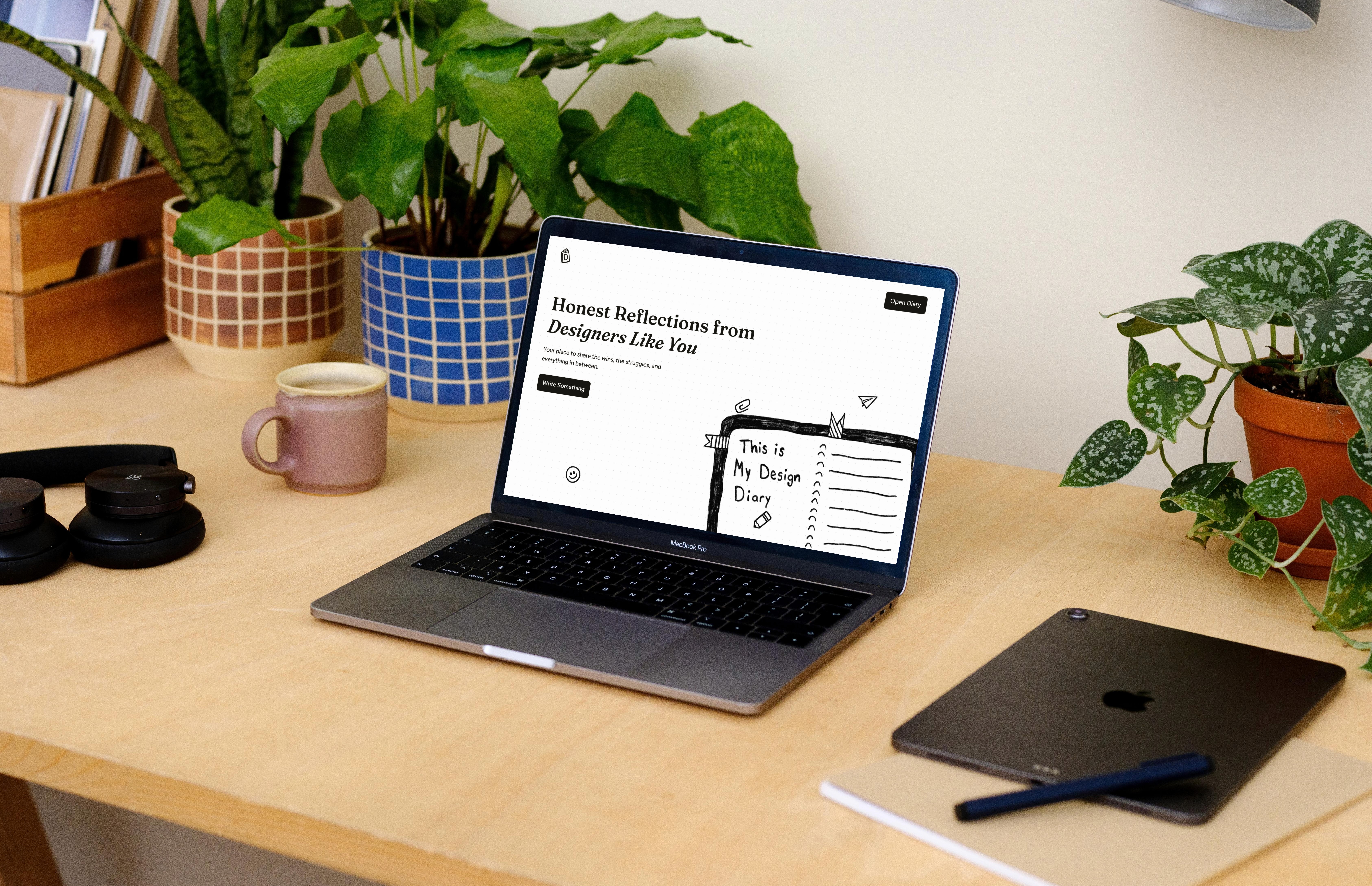
Design Student Workshop
A 25-minute workshop focused on deeper engagement and learning, followed by four weeks of five-minute in-class reflections
Lower the barrier to reflection through anonymous, low-stakes sharing
Build openness and empathy by reading and reacting
Turn reflection into a habit through hands-on use of Design Diaries and continued in-class reflection
Community & Growth
Expand reach beyond the classroom to build awareness and attract a broader mix of designers.
Build awareness through social content about the product’s story and process
Reach designers through online communities and forums
Grow through trusted networks of design students, early-career professionals, and educators
REFLECTION
My Call from Start to Finish
Research and AI both helped me get far, but not all the way. A lot of work and effort was still on me.
Past the Edge of Research
Research narrows the space for good decisions, but judgment fills in what research structurally can't answer. If I'd only built what users explicitly asked for, Design Diaries would be too safe and forgettable. The only way to move forward is to make a deliberate but reversible bet, something easy to undo if it doesn't work.
No Shortcuts, Even with AI
Claude and Lovable accelerated the work, but never replaced it. Left alone, AI often produces generic and flawed output, nowhere close to perfect, and definitely not a one-prompt solution. I had to constantly question, correct, iterate, and push back until it was worth shipping.
See Something You Like?
Available for full-time roles, freelance projects, and brand collabs.


